Goodreads Improved
Senior Project @ New York University
-
UX/UI Design, Branding & Visual Identity, Design Research
-
Figma, Adobe InDesign, Adobe Photoshop
A design overhaul of the biggest reading social network.
Goodreads is the largest online community for readers and book recommendations, operating as both a virtual bookshelf and social network. With over 90 million registered users and over 120 million visits over the past 6 months, Goodreads holds dominance over the book social space, with a monopoly in the discovery-through-search method. The platform has also developed close ties to the publishing industry, with book reviews on the site holding weight in terms of how to view a book’s success.
Despite the site’s popularity, it has consistently been hindered by outdated UX and UI. The desktop site is clunky and crowded with too much information, reminiscent of web design from 2007, which is fitting because Goodreads hasn’t been updated since then. While the platform has continued to add millions of books and users, the interface has not changed to the same level of progression. My senior thesis aimed to change this.
So why the redesign?
Research
My research consists of determining how Goodreads users really felt about their experience using the platform, as well as looking into where Goodreads is missing or hitting the mark. Along the way, I learned about the journey of a reader and answering the question of what exactly does a reader want from a platform like this
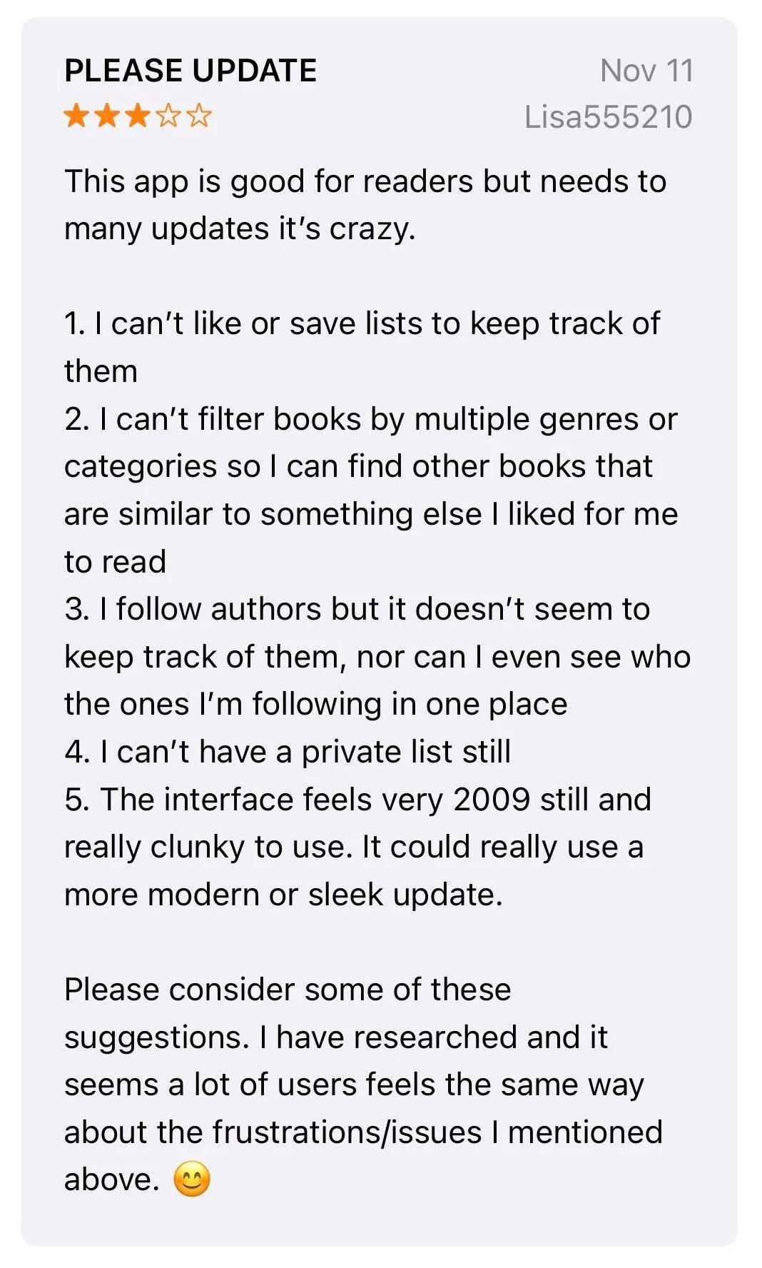
If you’re an avid reader, you’ve likely come across Goodreads on your hunt for new books like I did. However, every time I use it, there were various things that would put me off. Before doing anything else with this redesign, I looked to other users’ reviews to see if my experience with the platform was a common one. Turns out I wasn’t alone.
Hear It from the People
Readers on the Internet: Competitive Analysis
Since it seems as if Goodreads hasn’t done much to update or remodel their live site to meet expectation of users, alternative reading-centric social media platforms have been created. I researched the features and methods that each of these competitors offer versus what Goodreads offers.
What I Learned:
Goodreads is the least modern in terms of appearance and organization of features.
Competitors like The Storygraph and LibraryThing have a stronger emphasis on tailoring a more personalized reading experience and allowing more freedom in users’ book organization.
User Survey
To better understand the habits of Goodread users, I conducted a survey of 52 participants to learn more about what users think of Goodreads and how they utilize it.
Based on these results and other research, I was able to determine the areas where I can improve the platform.
Making Sense of It All
Outdated UI: For both the website and app, users mention the clunky interface which could be modernized.
Incomplete App: Users point out that the app versions are lacking in features that the website has. There’s also an inconsistency in interface with both versions, and both could be simplified and made easier to navigate.
Difficult Social Network: Users have a hard time navigating the social media component of the platform, such as adding friends, receiving updates, looking at profiles, and keeping track of updates from who they follow.
Pain Points
Streamlined Navigation and Browsing: More defined search function that can filter between categories of “title,” “author,” “readers,” etc. Tools and features are presented in a more straightforward manner.
Refined and Consistent Journey: Important information are presented more prominently and in a way that’s easier to digest. Website and app is consistent in function and look.
Control over Personalized Content: Adjust how bookshelves and ratings affect personalized recommendations, as well as a better algorithm that makes the experience more individualized. Users have a defined spot for updates and interactions with friends or groups.
Needs
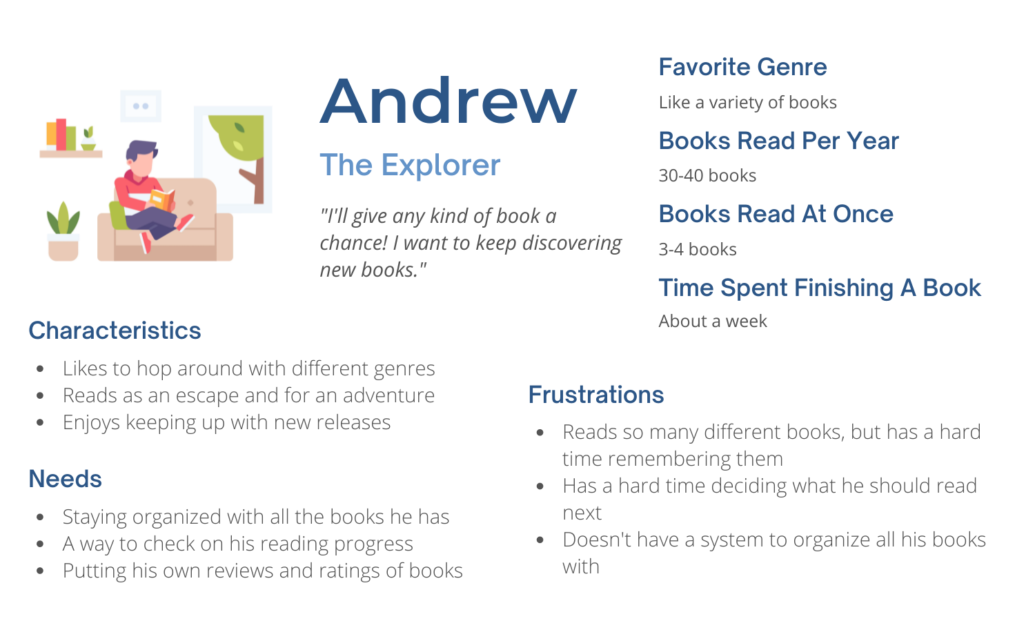
I created four personas stemming from the responses of the survey to provide a better visualization of the types of Goodreads users that there are and to empathize with their roles to better understand how they would interact with the platform.
Personas & Journey Map
During my research, I mapped out the parallels of the journey of a reader with the journey of a Goodreads user. For Goodreads to be the most optimized option for a reader, the platform should touch on all points of the reader journey.
The journey map visualizes the stages of the reading process and what Goodreads provides for each one. From here, we can see where Goodreads has the opportunity to improve in order to best assist their user base.
Design
I guess we can call this the fun part. With my reseach in hand, I began the design process, beginning from foundational wireframes and concluding with a fleshed out redesign of the Goodreads desktop and the Goodreads mobile application.
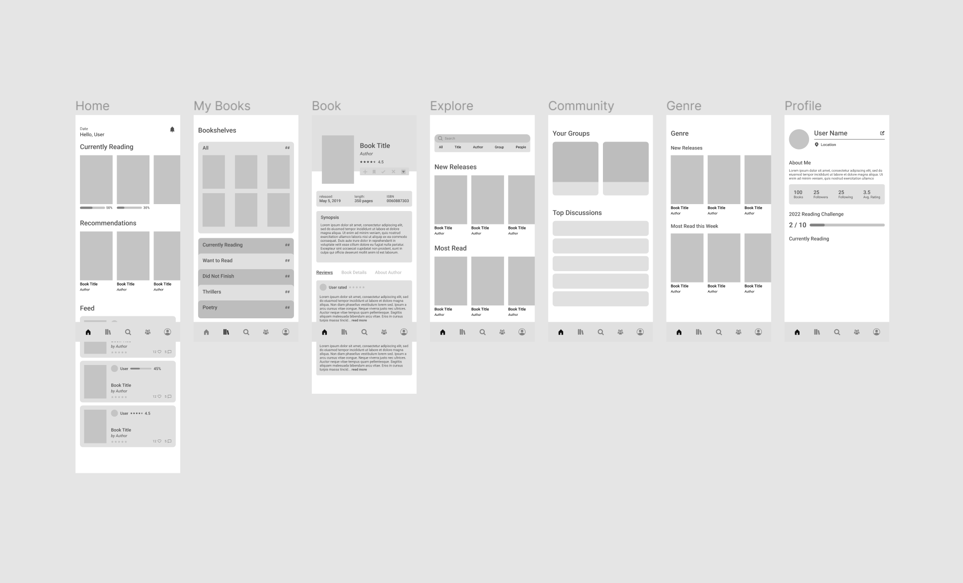
Wireframes
These wireframes are intended to be the the first layer of visual design for me to eventually build upon. This provided me with a sense of how to best organize the intended content and information.
Featured below is the full desktop and mobile prototype that finalizes this 4-month project. I focused on the primary pages of the platform: Home, My Books, Browse, Community, and Account, as well a few secondary pages in connection to them.
Prototype
View Desktop Figma Prototype 🡪
View Mobile Figma Prototype 🡪
Home Page
Organized Home Feed
Personalized content (book progress, recommendations, feed, news & interviews, lists) is accessible directly on home page in organized fashion.
My Books
More Customizable Library
Creation and organization of bookshelves are more in the hands of the user, with a modernized UI layout, tag system, and book detailing.
Browse & Genres
Visually Informational
I placed an emphasis on using visuals and illustrations to balance out the amount of text information needed. Genres are more broken down in terms of categories so users can find the top authors or niche book subgenres that they enjoy.
About a Book
Streamlined Navigation
The information that users would need are in one lozation
What I Learned
Planning is Crucial: With this being my senior project that encapsulates my four years at NYU, I wanted to complete a fully-fleged project. By properly managing my time for each phase of research, design, and iterating, I was able to complete this. Since I was creating a responsive design alongside the desktop one, I had to make sure I kept to my timeline in the design phase in order to ensure there was enough time for user testing and any adjustments needed.
Be Ready to Pivot: As could be discerned by the difference in my wireframes and final prototype, changes were made during the design process. I wasn’t satisfied by my inital ideas and took time to rethink and change my approach to this project. Being ready to pivot in my designs at any moment allowed me to complete a project I’m ultimately satisfied with and save time by making changes sooner rather than later.


